The Real Digital Divide? Advertised Vs. Actual Internet Speeds

By Roberto Gallardo and Brian Whitacre
Broadband data and maps have gotten a substantial amount of attention recently. In fact, Congress passed the DATA Act earlier this year to improve the accuracy of broadband maps.
Why? Well, broadband results depend on who you ask.
According to the Federal Communications Commission (FCC) Form 477 dataset—known to overestimate availability—approximately 21.3 million people lacked access to 25 Megabit per second (Mbps) download and 3 Mbps upload speeds as of December 2018. Compare that number to Microsoft’s where over 157 million people did not actually use the internet at speeds of at least 25 Mbps or BroadbandNow’s analysis concluding that at least 42 million people—twice the FCC’s number—did not have access to broadband.
Not very encouraging when similar metrics yield drastically different results.
Given that the FCC dataset is the most detailed dataset available—despite its multiple flaws—and utilized for funding and planning, we wanted to provide more information to properly interpret this data. We attempted to do this by comparing FCC average maximum advertised speeds with average M-Lab actual speed test results at the county-level in 2018.
Speed test results were obtained from M-Lab’s data repository (Kudos to M-Lab’s staff for providing the SQL script!). M-Lab is an open source database with contributors from civil society organizations, educational institutions, and private sector companies. For example, the TestIT app developed and promoted by the National Association of Counties (NACO) leverages the M-Lab platform, storing its results in their own database, and also sending the test results themselves to the M-Lab dataset.
As seen in the table, there were about 134.1 million speed tests conducted with download data and about 115.1 million with upload data in 2018. This compares to about 21.5 million records included in the FCC December 2018 dataset.
To better contextualize the FCC data and identify more granular discrepancies, counties were divided in two groups. The first group looked at the type of county and whether they were metropolitan or urban, micropolitan or suburban, and rural or noncore. The second group looked at median household income levels resulting in low income counties with a median household income of less than $44,978, middle income counties with median household incomes ranging from $44,978 to less than $54,387, and high income counties where the median household income was $54,387 or higher.
More than 90% of the speed tests or between 105 and 122 million took place in urban counties compared to 5% or between 6-7 million in suburban counties and less than 3% or about 3-4 million in rural or noncore counties. Regarding income, roughly a little more than three-quarters of download and upload speed tests were conducted in high income counties or between 89-100 million compared to 5-6% in low income counties or between 6-8 million.
| 2018 (Millions) | No. of M-Lab Download Speed Tests | No. of M-Lab Upload Speed Tests | No. of FCC Form 477 Records |
|---|---|---|---|
| Overall | 134.1 | 115.1 | 21.5 |
| Type | |||
| Urban | 122.3 | 105.7 | 15.6 |
| Suburban | 7.6 | 6.2 | 3.1 |
| Rural | 4.0 | 3.1 | 2.8 |
| Income | |||
| Low | 8.3 | 6.0 | 3.0 |
| Middle | 25.4 | 19.9 | 6.6 |
| High | 100.3 | 89.0 | 11.8 |
So, how did the average speed tests compare to the average FCC advertised speeds?
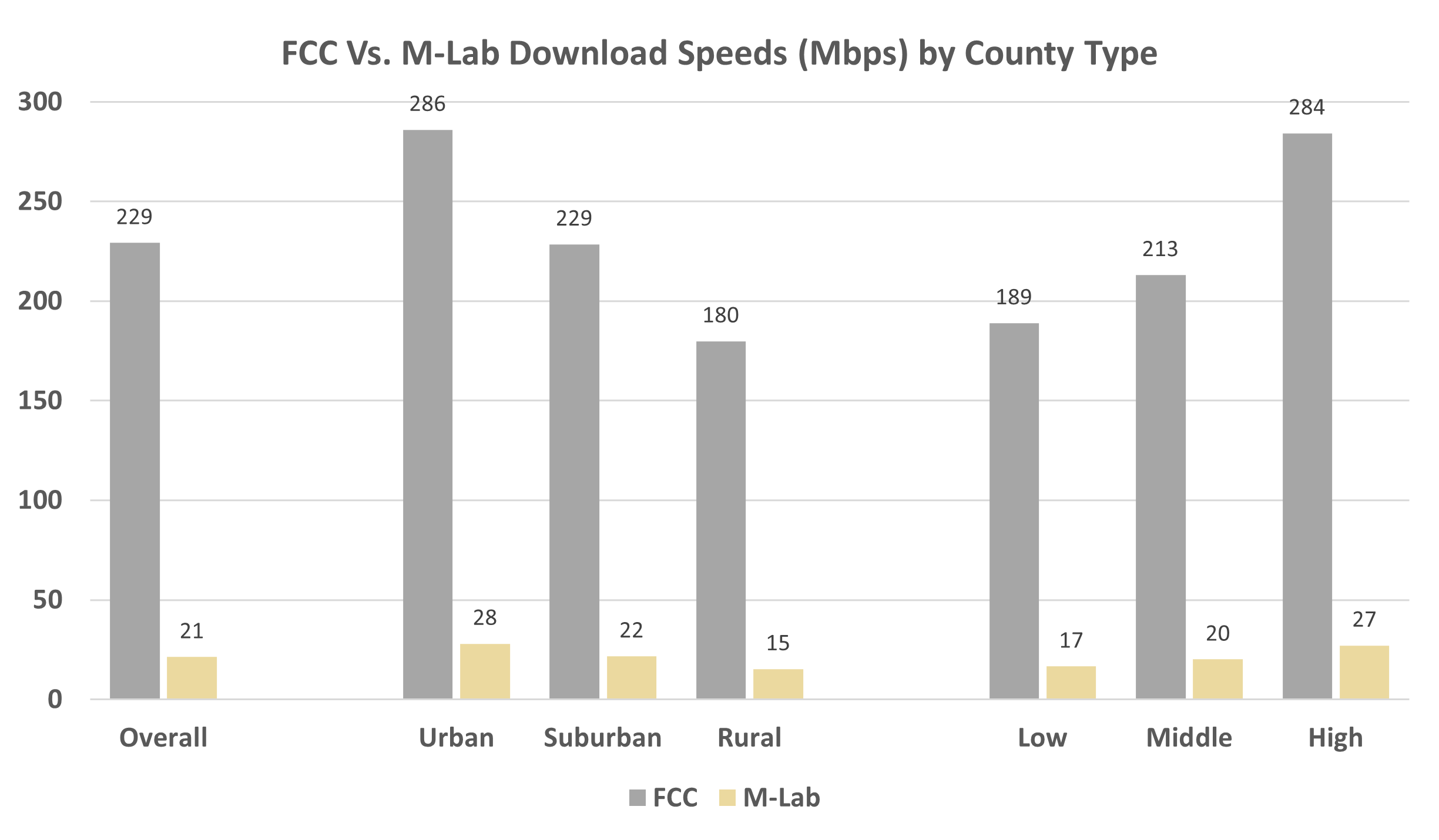
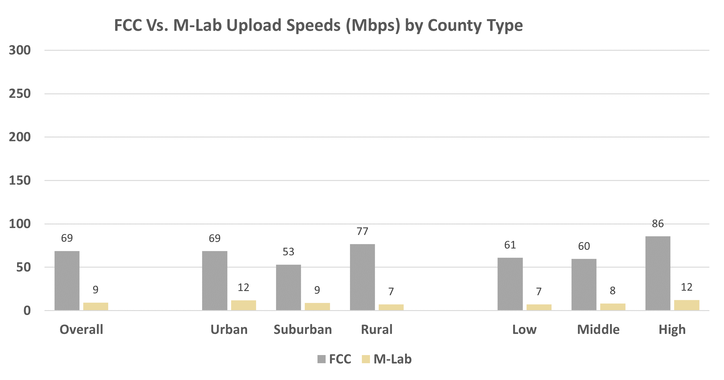
According to the FCC dataset, the average maximum advertised download speed for the nation was 229.245 megabits per second or Mbps while the average maximum advertised upload speed was 68.845 Mbps (see table below). According to M-Lab data on the other hand, the average actual download speed was 21.353 Mbps and the average actual upload speed was 9.334 Mbps.
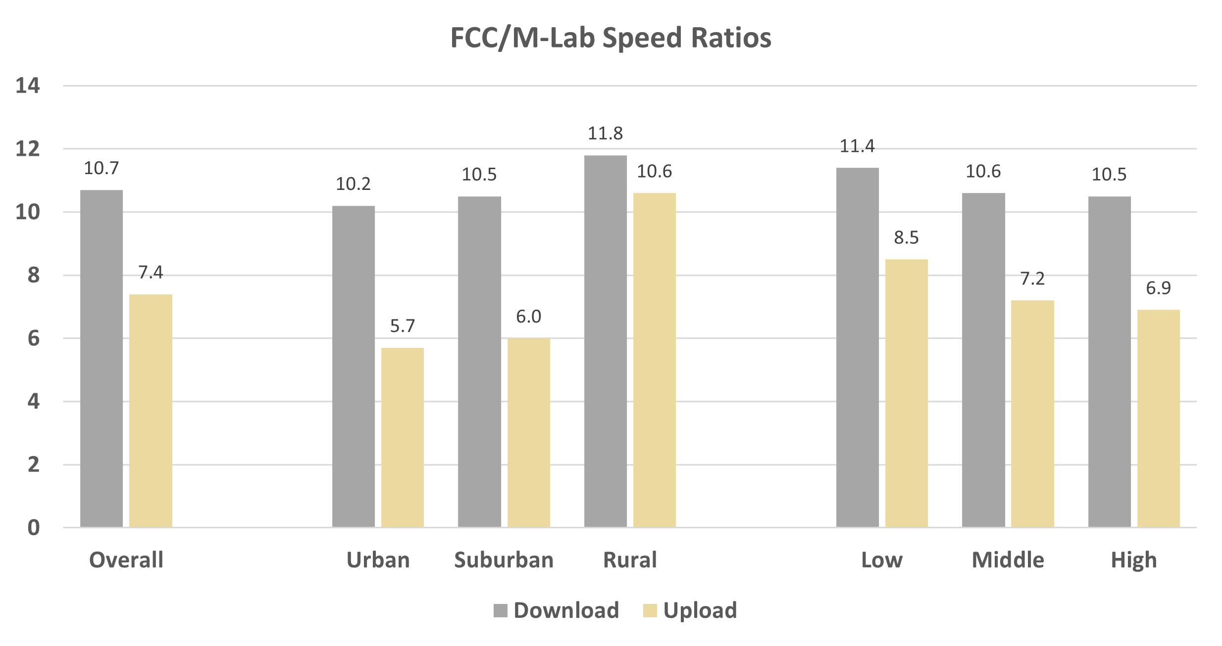
In other words, on average the FCC advertised download speed was 10.7 times higher than the M-Lab download speed versus 7.4 times higher for the upload speed.
Keep in mind, however, that these differences are likely explained by two main factors. First, the fact that some consumers (and ensuing speed tests) did not subscribe to the maximum advertised speed offered. For example, choosing to pay for a 25 Mbps connection instead of upgrading to a more expensive 200 Mbps.
Second, and more technical, M-Lab speed tests measure TCP reliability by measuring bulk transport capacity using a single stream test. The FCC maximum advertised speeds, on the other hand, are representative of total link capacity, not bulk transport capacity. In addition to these measurement differences, speed tests are affected by multiple factors that are not necessarily related to the bandwidth available. For example, the type of device, time of day, whether it is a wireless or wired connection, and number of devices connected at the time of the test affect the results.
Despite the technical differences, we feel these both metrics provide a richer, more useful context when interpreting broadband data.
| Average M-Lab Download Speeds (Mbps) | Avg. Maximum Advertised FCC Download Speeds (Mbps) | Download Ratio (FCC / M-Lab) | Avg. M-Lab Upload Speeds (Mbps) | Avg. Maximum Advertised FCC Upload Speeds (Mbps) | Upload Ratio (FCC / M-Lab) | |
|---|---|---|---|---|---|---|
| Overall | 21.353 | 229.245 | 10.7 | 9.334 | 68.845 | 7.4 |
| Type | ||||||
| Urban | 28.060 | 286.025 | 10.2 | 12.007 | 68.556 | 5.7 |
| Suburban | 21.723 | 228.511 | 10.5 | 8.915 | 53.158 | 6.0 |
| Rural | 15.308 | 179.893 | 11.8 | 7.197 | 76.636 | 10.6 |
| Income | ||||||
| Low | 16.617 | 188.941 | 11.4 | 7.188 | 60.964 | 8.5 |
| Middle | 20.133 | 213.112 | 10.6 | 8.303 | 59.562 | 7.2 |
| High | 27.147 | 284.268 | 10.5 | 12.423 | 85.578 | 6.9 |
Regarding download speeds, figure below shows the FCC and M-Lab speeds by county type. Note how the download speeds, both from FCC and M-Lab are slower in rural and poorer counties. Consider that the average download test speeds in low income counties was 17 Mbps versus 27 Mbps in high income counties. A similar pattern is shown with uploads (shown in the next figure). Notice also that upload speeds, both FCC and M-Lab, are significantly slower (both graphs show the same scale) compared to download speeds regardless of county type.
Finally, the figure below graphs the download and upload ratios by county type. Notice how the ratio—how much higher is the average FCC advertised speeds compared to the average test speeds—is higher in poorer and rural counties compared to urban and wealthier counties despite both the average download/upload speed test results and maximum advertised speeds being lower in rural and poorer counties compared to urban and wealthier counties.
On average, FCC advertised download speeds were 10.7 times higher than average test speeds in the country compared to 7.4 times regarding upload speeds. The largest difference in ratios was visible on urban counties (10.2 versus 5.7) while the lowest was in rural counties (11.8 versus 10.6). What this means is that in urban counties advertised upload speeds are closer to speed tests while in rural counties both download and upload speeds are not.
Source: PCRD; FCC Form 477 December 2018; M-Lab 2018
In conclusion, a couple main points are worth discussing. Despite the technical differences between both metrics (FCC and M-Lab), the lack of digital parity both in average speed tests and average advertised data is crystal clear. Higher advertised speeds may deter much needed investment in areas (rural, poorer) that need it the most when focusing on speed test results.
Second, both advertised and test speeds show that asymmetrical connections are the norm. Asymmetrical speeds place businesses, homes, and communities at a disadvantage, especially because upload speeds are significantly slower. This is not good when it comes to producing, or uploading content, in the digital economy. As COVID has shown by forcing multiple users in a home or business to utilize upload speeds more so than in pre-COVID times (videoconferencing, remote working, e-learning), slower upload speeds affect in a negative way online activities and participation of subscribers.
Lack of critical investments and slower actual speeds result in digital inequities that place rural and poorer counties further behind.
We advertising not only female viagra by the link below https://www.tadalafilaus.com/female-viagra.php but and other products to help students feel well
Use the interactive table below to search for your county. Or view table in a new window.

Roberto Gallardo is the Vice President for Engagement, Director of the Purdue Center for Regional Development and an Associate Professor in the Agricultural Economics Department.... read more