Loading Visualzation
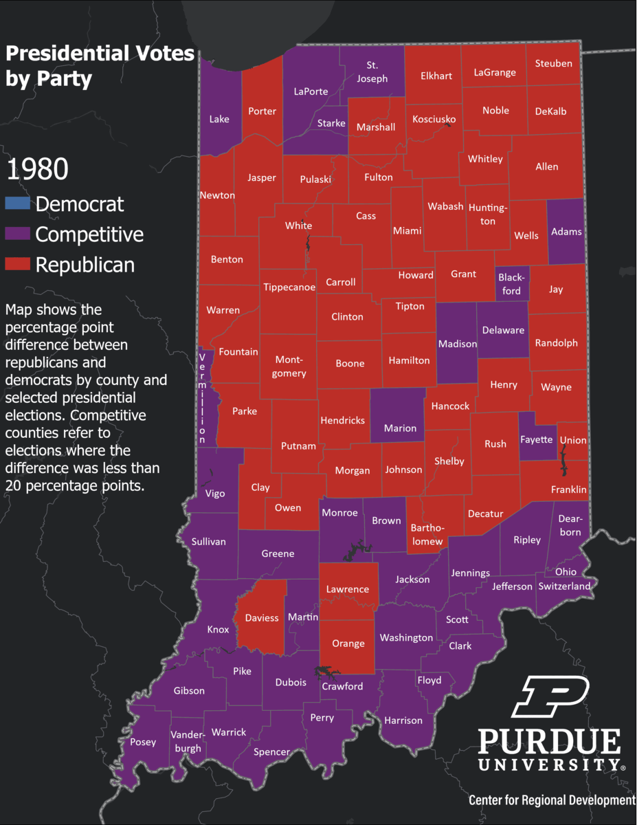
- DescriptonThis animated GIF shows data from the U.S. Election Atlas for presidential elections between 1980 and 2020. The idea is to showcase how competitive an election was (one where the difference between republican and democrat votes was less than 20 percentage points) implying a higher ideological diversity (purple counties). Red counties show counties where the republican candidate had more than 20 percentage points compared to the democratic candidate while blue counties show counties where the democratic candidate had more than 20 percentage points compared to the republican candidate.
- CategoryDemographic
- Data dateAugust 5, 2022
Have Data Needs?
Contact us to see how we can generate useful, beautiful, unique data tools just for you.
Contact Us