Using the Dashboard
A step-by-step walkthrough of the Regional Clusters dashboards.
Download PDF VersionThis dashboard provides insight into the economic competitiveness landscape of U.S. Economic Development Districts (EDDs), designated regions of the Economic Development Administration (EDA), U.S. Department of Commerce. It covers three types of cluster analyses, each with its own set of economic characteristics: Knowledge-Based and Skill-Based Occupation Clusters are analyzed by Employment in Cluster, Location Quotient (LQ), and Weighted Average Hourly Earnings, while Industry Clusters are analyzed by Employment in Cluster, Location Quotient (LQ), and Weighted Average Annual Earnings.
1. Getting Started
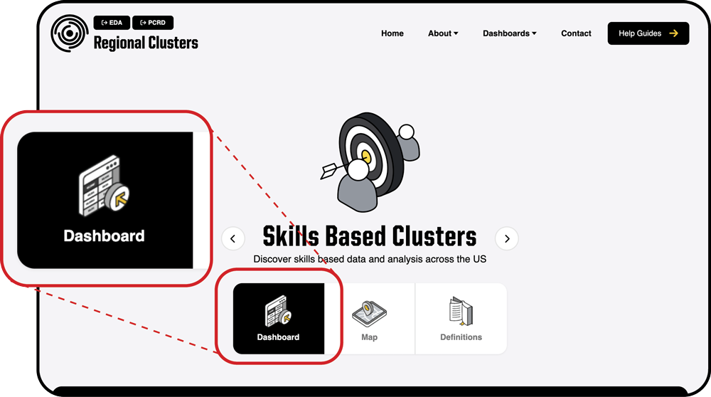
Navigate to the dashboard page by selecting a cluster type in the top menu. When the dashboard opens, be sure the Dashboard icon is selected (this is the default option). You can navigate through the cluster types by using the arrows surrounding the cluster title.
2. Selecting an Economic Development District
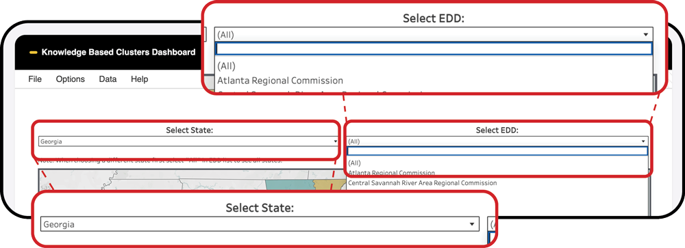
In the next section near the top of the dashboard, locate the State and EDD drop-down menus above the map.
- Begin by selecting a state using the menu on the left.
- After you choose a state, the EDD menu will update to show only the EDDs within that state.
- Next, select an EDD of interest using the drop-down menu on the right.
Tip: If you already know the name of the EDD, you may skip the state selection and choose it directly. Keep in mind that the full list includes more than 400 EDDs.
To return to the state selection, clear the EDD filter by clicking the small icon above the EDD drop-down menu or by selecting “All” from the list.
Once you select an EDD, all metrics for that EDD will appear in the charts below, and the map will automatically zoom to the selected area.
3. Viewing a Region at a Glance
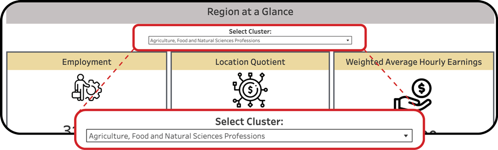
The Region at a Glance section presents Employment, Location Quotient (LQ), and Weighted Average Hourly/Annual Earnings for the selected cluster within the EDD chosen above. To switch from the default cluster, use the cluster drop-down menu above the infographics.
Note: If an individual EDD is not selected, the Location Quotient and Weighted Average Hourly/Annual Earnings cards will display averaged values for the state or for a group of EDDs.
For the Industry Cluster Dashboard Only
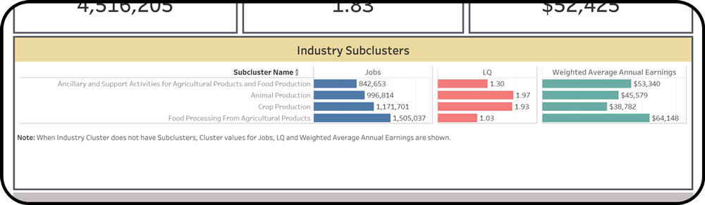
In addition to the three main cluster characteristics, the “Region at a Glance” section in the Industry Cluster Dashboard includes information about industry subclusters. When you select an industry cluster of interest from the cluster drop-down menu above the infographics, you will see a list of subclusters with the same three metrics presented as bar charts:
Note: Some industry clusters do not have subclusters. In these cases, the same industry cluster characteristics displayed on the cards above will be shown instead.
4. Viewing Detailed Economic Characteristics
In this section, you will find three charts providing a detailed view of Employment, LQ, and Weighted Average Hourly/Annual Earnings for the selected EDD.
Employment Bar Chart
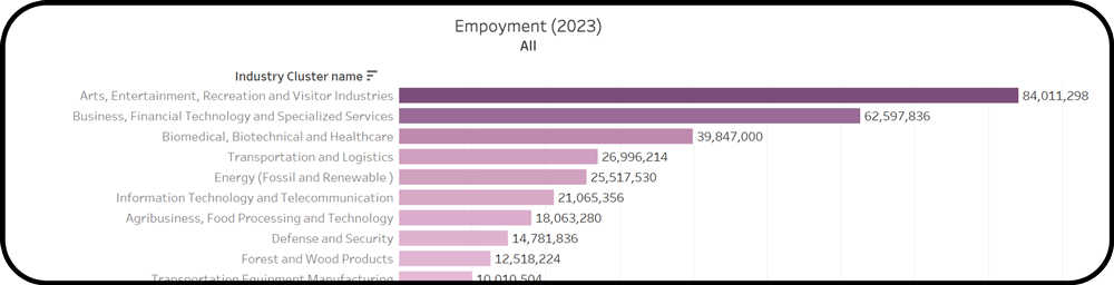
Shows how many people are employed within each cluster in the selected EDD. Clusters are arranged in descending order, with the largest employing cluster at the top and the smallest at the bottom.
Location Quotient (LQ) Bar Chart
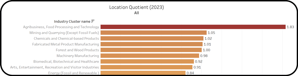
Shows which clusters are more specialized in the selected EDD compared to the nation. Clusters are arranged in descending order, from highest specialization at the top to lowest at the bottom.
Weighted Average Hourly/Annual Earnings Bar Chart
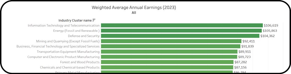
Shows the average earnings in each cluster in the selected EDD, weighted by employment (see methodology document). Clusters are arranged in descending order, from highest-paying at the top to lowest-paying at the bottom.
5. Exploring the Regional Clusters Chart
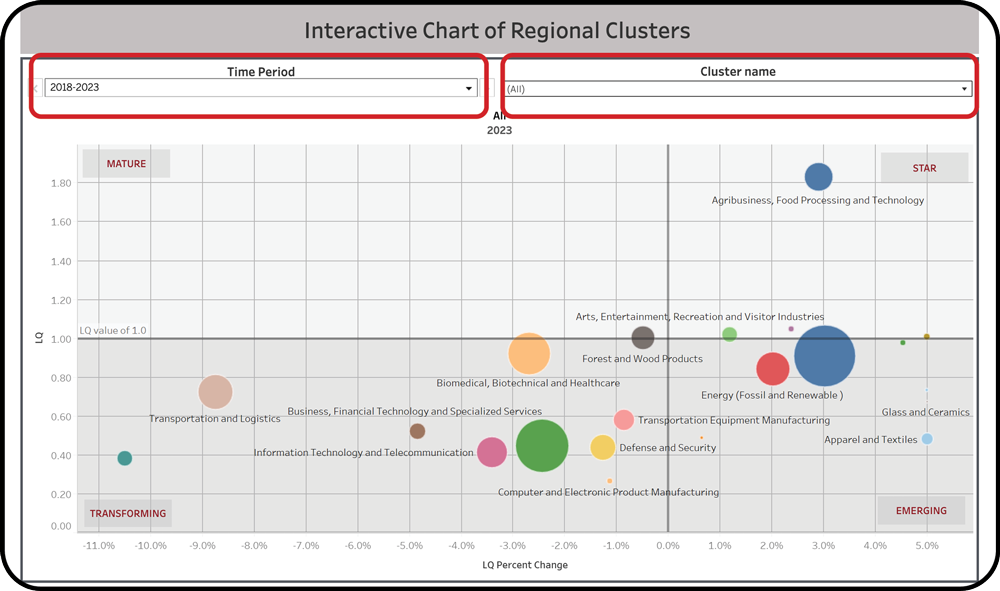
In this section, you can explore the entire economic landscape of the selected EDD. The bubble chart presents all clusters in the EDD and shows their current economic position:
- Bubble size represents employment in that cluster.
- Bubble position is determined by the current LQ and the percent change in LQ over the past five years.
The Four Quadrants
The chart is divided into four quadrants indicating the following trends:
- Mature — Well-developed clusters that are currently specialized but have lost their specialization during the time-period. They form the backbone of the regional economy.
- Stars — Fast-growing, specialized and competitive clusters that are drivers of the regional economy. These clusters should be considered in developing regional strategies.
- Transforming — Clusters that are currently not competitive and also lost their specialization in the time-period. Transforming clusters are in decline.
- Emerging — These clusters are not specialized in the current year, but are increasing their specializations in the selected time-period. These are clusters to watch because they have strong potential to become competitive for the region.
Drop-Down Menus
There are two drop-down menus above the chart:
- The left menu allows you to select the time period.
- The right menu allows you to select a specific cluster.
Time Period Selection
The chart shows both the current state of the region’s economy and historical trends. Selecting a different time period allows you to view the region’s past economic structure. Currently the only time period available is 2018–2023; more periods will be added later.
If you check the “Show History” option, you will see the previous positions of clusters along with their trend lines.
Cluster Selection
Use this selector if you would like to “zoom in” on the chart. Some clusters may be positioned far from the main grouping, making details harder to see. Uncheck such clusters in the drop-down list and click Apply to focus on the main group.
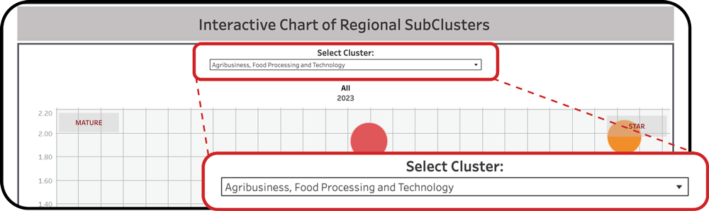
6. Exploring the Regional Subclusters Chart
*Industry Clusters Only
One more bubble chart in the Industry Clusters dashboard presents the current economic position of Industry subclusters for the selected Industry cluster in the EDD selected above.
As with the Regional Clusters chart, the subclusters bubble chart presents all subclusters for the selected Industry cluster in the EDD and shows their current economic position.
Select the Industry cluster of interest from the dropdown menu above the Regional Subclusters Chart to see all related subclusters.
7. Troubleshooting
01
Dashboard metrics show averaged values instead of specific data
Make sure you have selected an individual EDD. If an individual EDD is not selected, the Location Quotient and Weighted Average Hourly/Annual Earnings cards will display averaged values for the state or for a group of EDDs.
02
Subclusters section is not showing
Subclusters are only available in the Industry Clusters dashboard. Additionally, some industry clusters do not have subclusters. In these cases, the same industry cluster characteristics displayed on the cards above will be shown instead.
03
Bubble chart is hard to read because of outlying clusters
Use the cluster drop-down menu above the chart to uncheck outlying clusters and click Apply to focus on the main group. This allows you to “zoom in” on the chart for a clearer view.
8. Get More Help
For assistance with the dashboards, maps or definitions — email regionalclusters@purdue.edu or fill out the contact form.