Loading Visualzation
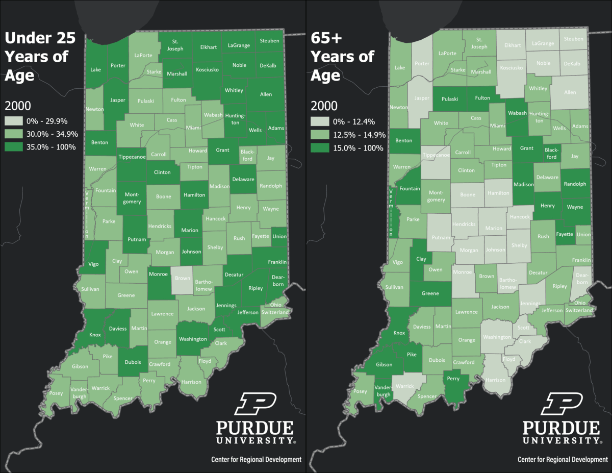
- DescriptonThis animated GIF shows two maps that used U.S. Census Population Estimates by age groups. The objective it to showcase the changing share of those under 25 and those age 65 or older of the total population per year between 2000 and 2021. Unlike what is happening in the country, the share of those ages 65 or older is increasing in multiple counties across the state.
- CategoryDemographic
- Data dateAugust 5, 2022
Have Data Needs?
Contact us to see how we can generate useful, beautiful, unique data tools just for you.
Contact Us