IARC Data Dashboard Update

Written by Bertin Mbongo and Andrey Zhalnin.
January is not over yet and PCRD can already check off one new year’s resolution our list: updating the IARC data dashboard! Found at iarcdatadashboard.com, this tool features data for each region in the Indiana Association of Regional Councils (IARC). The previous version of the IARC data dashboard included data for each IARC region as a sequence of charts. A printable report was not readily available and comparing data among regions was a cumbersome task. In addition, county level data was not available.
With these shortcomings in mind, we created a new and improved version of the IARC dashboard. The new IARC dashboard is a map driven visualization tool that combines maps and charts to create a dynamic information dashboard. In addition, the data were updated to the latest available year (2018).
The new IARC dashboard has 3 distinctive parts:
- Regional dashboard
- County level data dashboard
- Regional Interactive reports
This dashboard can be useful for decision makers across the state of Indiana while exploring strengths and weaknesses of their regions. For example, looking at industry and occupation clusters of a region can be helpful in finding potential economic development opportunities. Commuting information may be useful when determining employment strategies in the region. The recently added metrics on broadband quality can help to identify problematic areas that may be affected by the recent COVID-19 pandemic.
Next, we discuss each part to discuss their distinctive advantages.
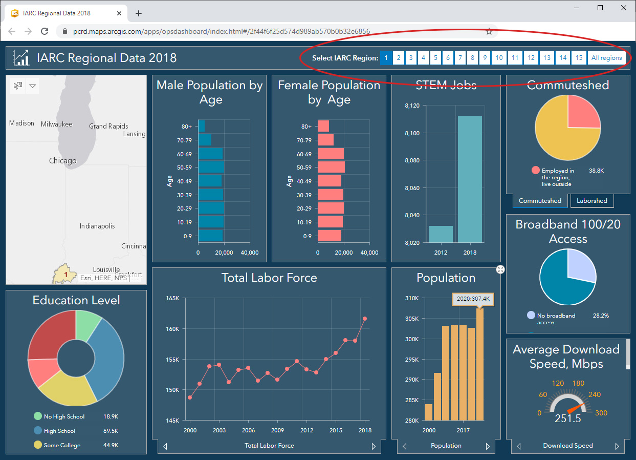
Regional Dashboard
The regional dashboard shows major economic and demographic indicators for IARC regions and allows quick comparison between regions as well as summarizing information for several regions. It includes the following 16 indicators:
- Population change
- Population in poverty
- Minors in poverty
- Male population by age
- Female population by age
- Educational attainment
- STEM jobs
- Total labor force
- Employed
- Unemployed
- Unemployment rate
- Commuteshed
- Laborshed
- Broadband access
- Average upload speed
- Average download speed
Dashboard allows the user to select individual regions as well as see statistics for all regions combined. Users can select the region by clicking on the button in the upper right corner of the dashboard. In addition, the dashboard includes a map that shows location of the selected region.
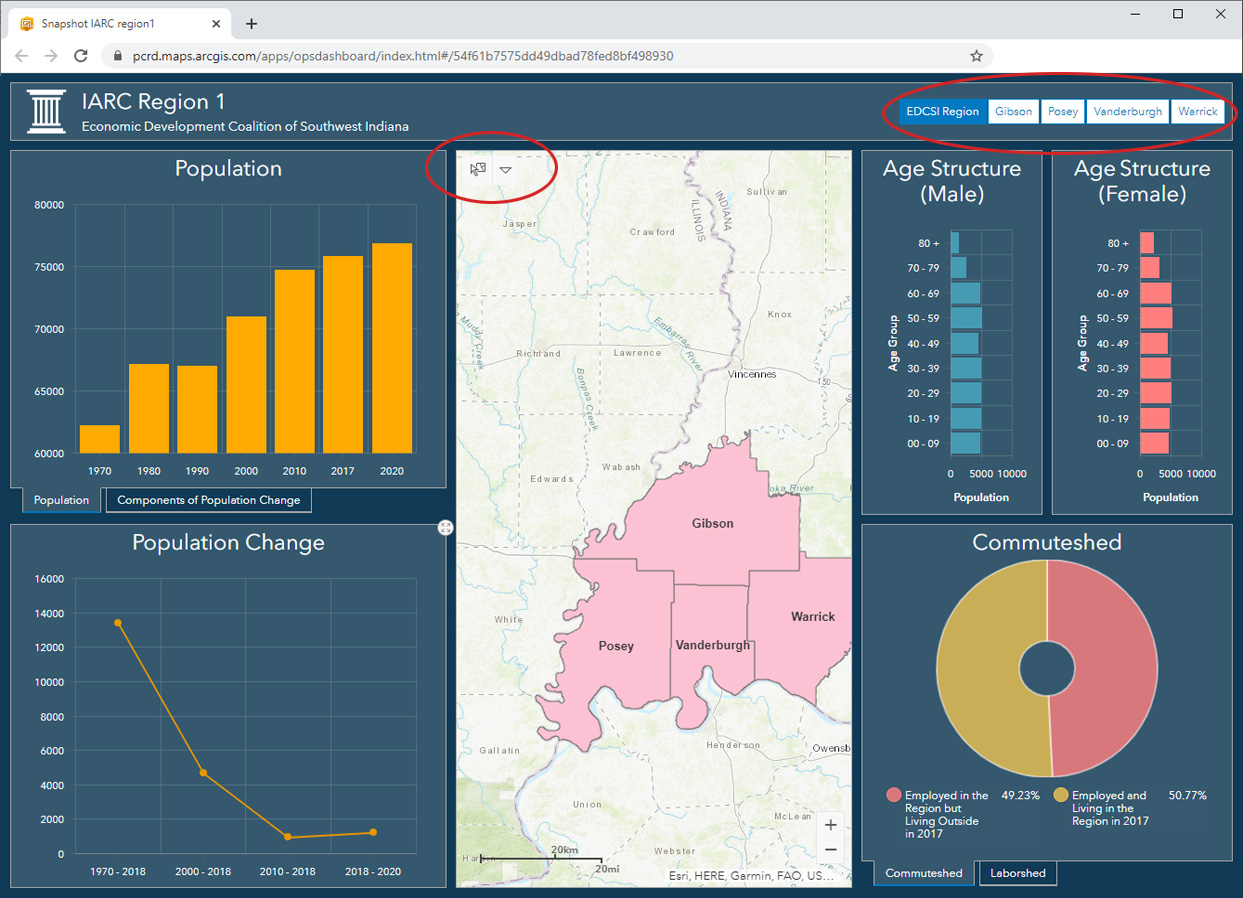
County Level Dashboard
The county level dashboard allows users to drill down data to a specific county. Please note that not all indicators from the regional level are available at the county level and vice versa, due to data availability or the nature of analysis. The county-level dashboard includes the following 7 indicators:
- Population
- Population change
- Components of Population Change (2010 – 2018)
- Male population by age
- Female population by age
- Commuteshed
- Laborshed
Access to each region’s county dashboard is available from the main page. There are two ways to interact with the dashboard: the county selector and the map. Once the dashboard is open, users can select individual counties using the county selector tool that is located in the upper right corner of the dashboard. It includes the regional button followed by county buttons. By clicking on the first button, the data for the entire region will be displayed. When clicking on the county button, the outline of the selected county will flash on the map and all the data will change to that county’s data.
The selection from the map can be done by using the selection tool in the upper left corner of the map window. This method allows selecting and viewing statistics for several selected counties.
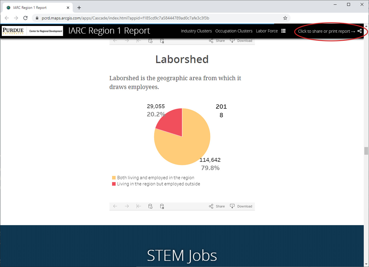
Regional Interactive Reports
This section of the IARC data dashboard is designed to provide users with a comprehensive printable report. The access to each region’s dashboard is available from the main page. By clicking on the region’s link users will open the web page and scroll down to view the data. This report is the most comprehensive and in addition to the indicators available in the regional dashboard, it has industry and occupation cluster data. All charts in this report are interactive and can be saved as images or other formats. A print option for the entire report is available from the share icon in the upper right corner of the page.
Overall, the new version of the IARC data dashboard should provide users with more options, an improved navigation experience, and enhanced data visualizations. Check out your region’s data by clicking the button below.

Andrey Zhalnin is a GIS/data analyst for the Purdue Center for Regional Development, joining the staff in 2011. Andrey uses a variety of GIS and... read more