Can You Tell Me a Story? Storytelling With Data
Written by Roberto Gallardo.
Today, data is everywhere. Public datasets are available through multiple sources and covering topics such as health, economic, industrial, demographic, and talent. Internal performance data is available to the organization’s gathering it. Program or project outputs are available to the organization’s responsible for designing and implementing them. Surveys are being conducted every day, which in turn, generate a lot of data. And lastly, when analyzing data, we also generate additional data. In other words, data is all around us.
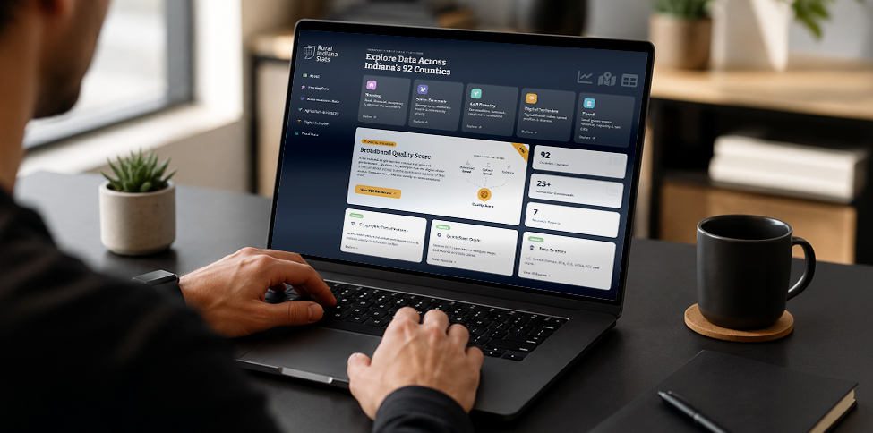
Up until several years ago, how to present all this data in a way that was user-friendly was the challenge. Today, several third-party platforms exist that allow users—not only data savvy users but any users with basic data interest—to present data in many formats in one location, often called “dashboards”: maps, bar charts, trend lines, etc.
And while data visualization is and will continue to be critical for any organization involved in data gathering and analysis, an emerging theme is equally if not more important: storytelling. Us humans have been storytellers for thousands of years. Stories based on data are very useful as well. Here is the next frontier if you ask me: storytelling and insights.
Granted, it was well known since data became the 21st century’s equivalent to oil in terms of a resource with tremendous potential earlier this century that insights and information were going to be critical. What I think is slightly different and provides a competitive advantage today is the ability to provide insights and information through stories. The odds that this information and insights will “stick” is higher when telling them through a story.
But what exactly is a story? That is a good question. For our purposes, a story does not only follow a theme and allow the user to extract lessons learned or key highlights but also how fast or how slow it is told (or consumed) should be controlled by the reader (or user). In addition, these stories need to allow for interactive components.
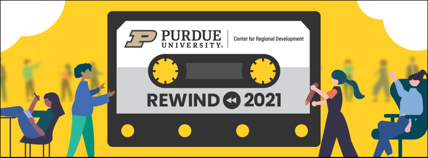
For these reasons, I am extremely proud to present the Purdue Center for Regional Development (PCRD) 2021 annual report. The story theme is to rewind, to look in hindsight at the awesome things this great team accomplished. While not meant to be comprehensive, it was designed to let our stakeholders read our story, at their own pace, about our highlights. Scroll animations were added to mimic the illustrations in children’s books because who does not grasp lessons learned from a child’s book? And yes, this story is about celebrating and/or highlighting our short-term successes but soon will be one about impacts and outcomes.
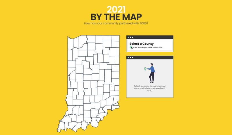
Perhaps the most interesting feature is an interactive map at the end where we outline the awesome partnerships PCRD had per county during 2021. This map was entirely inspired in a question I get asked frequently: what has your Center done for my county?
This is only the beginning. We will tweak, update, and innovate to make this tool even better. Also, stay tuned for other stories related to some cool projects we are involved in. After all, we like to pioneer ideas. And we are very proud of this one.
View the full report here:

Roberto Gallardo is the Vice President for Engagement and an Associate Professor in the Agricultural Economics Department. He holds an electronics engineering undergraduate degree, a... read more