FCC Broadband Collection
Recent Update (7/10/2023)
Interactive charts/dashboards in this article have been updated with December 2022 data.
The Federal Communications Commission (FCC) is currently engaged in a new broadband data collection effort after adopting the Digital Opportunity Data Collection (DODC) program in 2019 and Congress passing the Broadband Deployment Accuracy and Technological Availability (DATA) Act. This has resulted in a national map at the address level identifying areas with broadband and areas without broadband.
The FCC defines broadband as an internet connection that is always on and faster than dial-up. Broadband can be delivered through multiple technologies including digital subscriber line (DSL), cable, satellite, fixed wireless, and fiber-optic. These technologies have different data carrying capacities resulting in different speeds. In addition, latency is another thing to consider when looking at broadband availability. Latency refers to the time elapsed between your device making a request and getting a response (e.g., open a website).
The ongoing broadband mapping effort identifies broadband serviceable locations or BSLs and categorizes them into three groups:
Served
BSL is considered served if it has a low-latency Fiber, Cable, Copper, or Licensed Terrestrial Fixed Wireless offering of speeds greater than or equal to 100 Megabits per second (Mbps) download and 20 Mbps upload, or 100/20 Mbps.
Underserved
BSL is considered underserved if it has a low-latency Fiber, Cable, Copper, or Terrestrial Licensed Fixed Wireless offering of speeds less than 100/20 Mbps, but greater than or equal to 25/3 Mbps.
Unserved
In all other cases, for all other transmission technologies (Geostationary Satellite, Non-geostationary Satellite, Unlicensed Terrestrial Fixed Wireless, and Other), and all service that is not low-latency, a BSL is considered unserved.
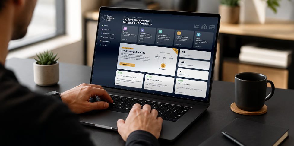
The Purdue Center for Regional Development (PCRD) has put together a dashboard using the Environmental Systems Research Institute (ESRI) Living Atlas broadband data obtained from the FCC to help residents and communities understand their broadband landscape.
It is important to understand this landscape because this map will be used by the Broadband Equity, Adoption, and Deployment (BEAD) program to distribute more than $40 billion to build/improve broadband infrastructure across the country. Note that this map will be updated every six months.
PCRD has created two different dashboards, one strictly for Indiana and the other for all of the United States. By scrolling down on the website, the first bit of interactivity will be a dashboard that allows the data to be filtered by 3 sets of geography states, counties, and census tracts. In the dashboard, you can notice the table that filters the geography by the specific region, by default the USA dashboards will display all 50 states. In the table, you can see at the bottom that 88.5% of all states are deemed served BSLs. Indiana is a bit below this at 86.7% served BSL. Some counties such as three within American Samoa have 100% underserved BSL. Indiana’s highest underserved county is Benton at 46.8% BSL underserved. However, Franklin County, IN is Indiana’s highest county that is underserved BSL at 57.6%. The United States has many census tracts that are considered 100% unserved BSL. Whereas Indiana has only 7 census tracts with an unserved BSL rate of 80% or higher. In addition to the table within the dashboard, several bar charts indicate whether BSLs are served, underserved, or unserved by specific broadband technologies. If one wonders how a technology like fiber or cable can be used and remain in the underserved or unserved category, remember that not only Mbps is needed to meet a specific threshold, but low-latency is factored in as well.
Continuing to scroll down the website you will see a map providing broadband information. This map is authored by Patrick Ryan of ESRI, and the credit goes to him for creating this map. The map provides similar broadband information as the dashboard but allows one to look into it from a spatial visualization standpoint. The map has geographies for state, county, census tract, block groups, block, and H3 Resolution 8 (hexagonal polygons). The value in the map comes from within the popups. Have the zoom level set to the desired geography, then simply click on the map. A pop-up with broadband-related information will then become available.
The FCC broadband collection website is useful because it allows people to see where there is and is not broadband being served. In doing so, challenges may arise. The FCC data is not perfect and seeks community input to improve and increase the accuracy of the map. For more broadband-related information, visit some of the other projects PCRD has completed. Lastly, the website will be updated when more current data becomes available. Please reach out to PCRD (pcrd-web@purdue.edu) with any comments or questions.
If you need help using the dashboards above, please watch this short tutorial video created by PCRD.

Benjamin St. Germain is a GIS Analyst for the Purdue Center for Regional Development, joining the staff in 2015. Benjamin uses a variety of data... read more