How Efficient Is Your Entrepreneur Pipeline?

Written by Roberto Gallardo and Indraneel Kumar.
Studies have found that the share of businesses less than one year old have declined by almost half between 1980 and 2015. This in turn is making the U.S. economy “old and fat“. Entrepreneurs and startups are critical for a healthy and dynamic economy creating jobs, innovating, and competing. Obviously, this does not help when evidence is showing the country has two economies—one traditional, lower-skill versus a higher-skill, higher-tech—that are growing apart quickly.
Multiple indicators can measure entrepreneurs and startups. Some of these include: 1) the National Establishment Time Series (NETS) that track establishments over time; 2) nonfarm proprietors available from the Bureau of Economic Analysis; or 3) the U.S. Census nonemployer establishment dataset and/or a category of self-employed in the class of worker table available from the American Community Survey.
While these indicators are useful and provide different angles to measuring entrepreneurs, they are not helpful to gauge how efficient is an entrepreneur pipeline. In other words, how does the share of entrepreneurs compare to an expanding or shrinking overall share of workers and population.
For this reason, we explore a new metric in this post that factors in multiple variables that ultimately affect the number of entrepreneurs in an area. This metric was inspired by the well-known location quotient (LQ) metric used in industrial or occupation analyses. The employment-based LQ is a measure of industry or occupation concentration of jobs compared to the nation.
We used the following indicators to measure entrepreneurship efficiency or EE obtained from the 2013-2017 American Community Survey:
- Number of self-employed workers with incorporated and non-incorporated businesses;
- Number of workers ages 16 and over;
- Total population ages 16 and over
Self-employed divided by workers 16 and over would give you one of the “traditional” measures of entrepreneurship. However, we divided this “traditional” metric by the share of workers 16 and over of the population 16 and over. While total population was considered, we felt population 16 and over is a more accurate apple-to-apple comparison. This second share accounts for an expanding or shrinking “base” of workers and population, from which potential entrepreneurs are drawn from to begin with.
The formula boils down to: EE = (Self-employed/Workers ages 16 and over) / (Workers ages 16 and over/total population 16 and over).
If the EE is higher than one, it shows that the share of self-employed of total workers is higher than the share of workers from total population. To make it simple: a higher EE is better, denoting a more efficient entrepreneur metric factoring in the worker/population base from where potential entrepreneurs emerge.
Consider the figure below that highlights the metrics used to construct the EE by county types using the rurality matters criteria from the U.S. Census. Urban counties had less than one percent of their population living in rural areas; mostly urban counties had between one and 49.9% living in rural areas; mostly rural had between 50 and 98.9% of their population living in rural areas; and rural counties where 99% or more of their population lived in rural areas.
As expected, the population 16 and over is ten times larger in urban counties compared to rural counties (49.4 million versus 4.5 million). This in turn makes the number of workers much higher in the urban counties compared to rural counties (29.2 million versus 2.2 million). Lastly, the entrepreneurs are also higher in urban counties compared to rural counties as well (2.9 million versus 0.3 million).
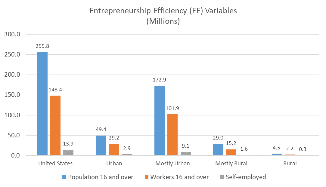
Source: PCRD; American Community Survey
Ok, so enough with boring formulas. How does the EE compare across county types and to other “traditional” metrics?
Due to data availability, we compared the 2017 EE with three other measures of entrepreneurship: share of nonemployer establishments from all establishments (NEMP); share of nonfarm proprietors from total employed (NFP); and percent self-employed from workers 16 and over, including those with incorporated and non-incorporated businesses (SE).
Two things are worth discussing. First, the range of these metrics for the U.S. overall range from 0.766 (share of nonemployer establishments or NEMP) to 0.094 (share of self-employed of workers age 16 and over or SE). Overall, share of nonemployer establishments was higher. However, this does not necessarily compare apples to apples since this metric utilized establishment data while the other utilized workers. Regardless, this helps explain why entrepreneurship can mean different things to different areas, depending on the metric used.
Second, note how rural counties outperformed all other county types in three of the four entrepreneurship metrics analyzed, including the EE metric. Urban barely outperformed rural in the share of nonemployer establishments (NEMP).

Source: PCRD; American Community Survey; Nonemployer Dataset; Bureau of Economic Analysis
But, is EE more strongly correlated, to say, county gross domestic product or GDP than the other variables? In other words, does it have a slightly stronger relationship level? For that, we turn to the table below showing Pearson correlation coefficients where a number closer to +1 or -1 indicates a stronger directional relationship but not causality.
As shown, the EE metric had a stronger relationship with GDP in all but the completely urban category (higher coefficients in bold). However, and a surprising finding, is that the majority of Pearson coefficients were negative, except for the share of self-employed of workers ages 16 and over (SE) and the entrepreneurship efficiency metric (EE) in completely urban counties and the share of nonemployer establishments of all establishments (NEMP) in mostly urban counties.
In other words, as the majority of entrepreneurship metrics analyzed increased, GDP decreased. This was not the case in urban counties where a higher SE and EE resulted in higher GDP as was in mostly urban counties with NEMP.
| GDP | n | NEMP | NF | SE | EE |
|---|---|---|---|---|---|
| All | 3,104 | -0.009 | -0.069** | -0.083** | -0.124** |
| Urban | 45 | -0.125 | -0.059 | +0.398** | +0.393** |
| Mostly Urban | 1,184 | +0.106** | -0.009 | -0.063* | -0.122** |
| Mostly Rural | 1,162 | -0.164** | -0.178** | -0.147** | -0.244** |
| Rural | 713 | -0.062 | -0.130** | -0.148** | -0.173** |
** significant at the 0.01 level; * significant at the 0.05 level
What is clear is that rural counties had higher levels of entrepreneurship, in three of the four measures analyzed. In fact, rural counties had a higher share of entrepreneurs when factoring in its share of workers from the population ages 16 and over. In other words, completely rural counties had a more efficient entrepreneur pipeline compared to urban counties.
However, this entrepreneurship activity is not reflecting on counties’ GDP. One reason could be that nonfarm proprietor income, for example, accounted for less than ten percent of personal income in 2017 making it difficult to move the larger GDP needle. On the other hand, could it be that rural ecosystems are generating a higher share of entrepreneurs despite their much lower worker/population base but at the same time is limiting their economic growth potential perhaps due to poor internet connectivity, lack of venture funding, and/or a shortage of skills and workers?
Additional number crunching is needed to fully understand why the majority of entrepreneurship metrics had a negative impact in GDP. Keep in mind that correlation does not mean causation, but still, there is something interesting going on here.
In our next blog post, we will take a deeper look at a newer (2018) entrepreneurship efficiency (EE) metric to better understand how it plays out in Indiana and the country.

Roberto Gallardo is the Vice President for Engagement and an Associate Professor in the Agricultural Economics Department. He holds an electronics engineering undergraduate degree, a... read more